AI’s x-ray vision into Texas’ air limits
Texas sets its own limits for hundreds of industrial chemicals. Where they can be compared with EPA's and ATSDR's, 36 of 41 come out the same or weaker. The reasoning is buried in thousands of pages of assessment.



Texas sets its own limits for industrial chemicals in its air. When these limits are compared with those recommended by the US Environmental Protection Agency (USEPA) and Agency for Toxic Substances and Disease Registry (ATSDR), 36 limits of 41 come out the same or weaker, often by orders of magnitude. The technical assessments for establishing the limits are thousands of pages long, which obscures the scientific reasoning behind the decisions. Reading and understanding those reports used to be a daunting task, if not a barrier, for a layperson.
Now, AI gives researchers and laypersons a sort of x-ray vision, letting them look straight through these regulatory documents. This article is an example of such an AI-assisted investigation.
What is set by the federal government?
For six air pollutants — ozone, soot, carbon monoxide, sulphur dioxide, nitrogen dioxide, and lead — the USEPA sets one national limit, and every state uses it. For several hundred other hazardous chemicals there is no national limit. The USEPA publishes recommended values but each state decides what it will allow.
Many states do not put much effort into deriving or updating their own limits for other chemicals. For example, Louisiana’s assessment efforts date to December 1991 and its numbers have hardly moved since. New Mexico divides workplace exposure limits by 100, and its own board conceded in 1995 that “[t]his authorization is not intended to represent, and should not be interpreted as, a finding by the Board that these factors are suitable for determining safe or unsafe ambient air concentrations.”
Texas is an interesting case. It refines a third of the country’s oil and therefore has a lot of potential for air pollution. It also has a working toxicology division — the Toxicology Division of the Texas Commission on Environmental Quality, or TCEQ — which publishes assessments for each chemical it evaluates.
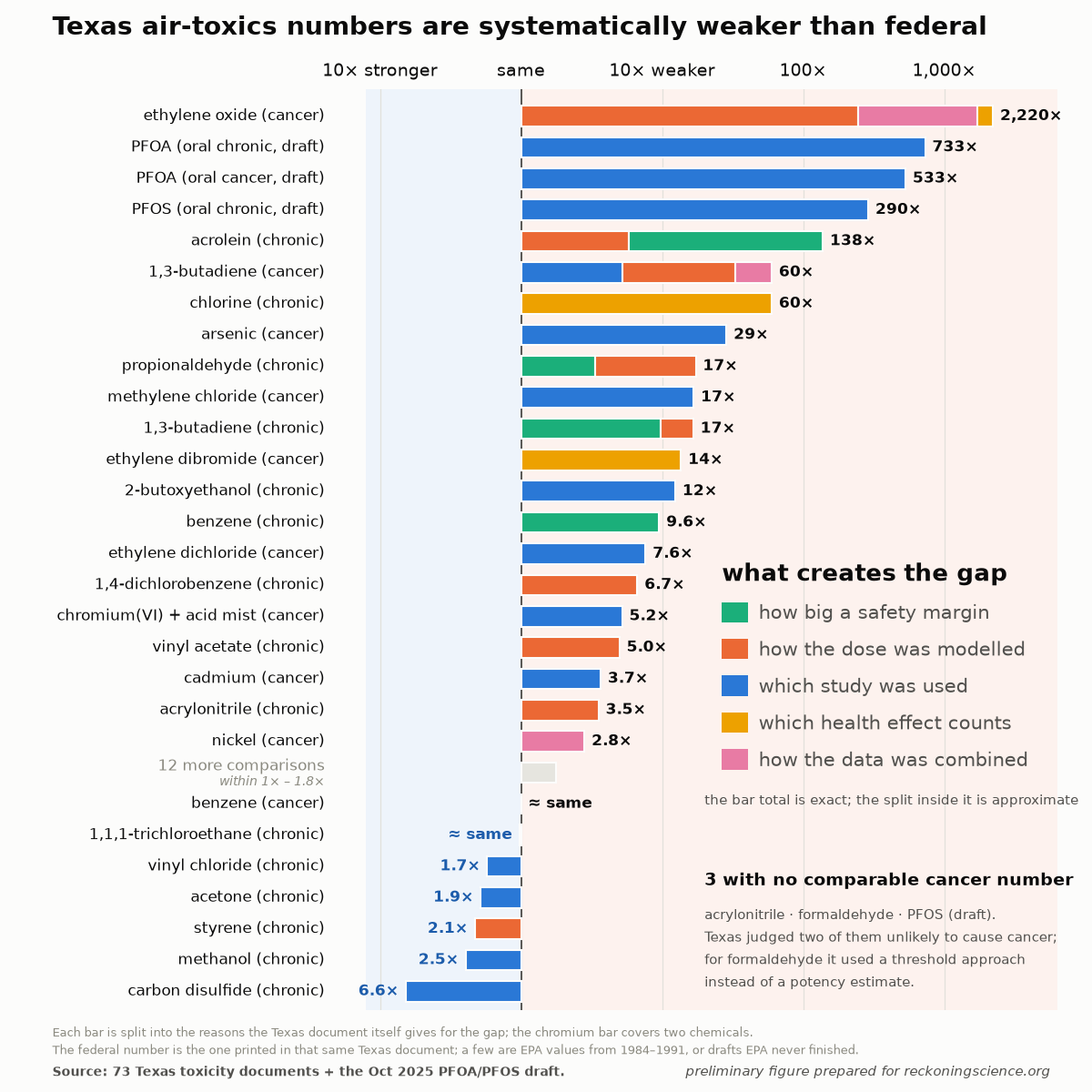
Five of the values Texas derived are stricter than the federal ones. The rest are the same or weaker, sometimes by orders of magnitude, as shown in the figure below.
The assessments that toxicologists perform resulting in safety guidelines are rooted in science, and Texas’ access to scientific literature is the same as the USEPA’s.
So how come the same science leads to numbers that are orders of magnitude apart?
TCEQ itself provides justifications for this divergence, which is shown in color codes in the figure above. Normally parsing these documents would be a Herculean task, but now, with a suite of AI models, this summary can be extracted almost effortlessly, with built-in verification, of course.
However, a more important question is whether the justifications provided by TCEQ are legitimate and scientifically-based. Here we again can utilize AI to excavate individual reasonings, and examine where the numbers come from and how interpretations of them differ. Below is an example of an investigation into just one disagreement between the USEPA and TCEQ limits derivations. Utilizing AI makes such examinations not only economical, but probably even more importantly scalable.
Ethylene oxide as a use-case for a gap based on how the dose was modeled
As a use-case, let’s look at how the top case’s, ethylene oxide, limit resulted three orders of magnitude difference. Ethylene oxide (EtO) is a sterilizing gas and a carcinogen. Both agencies used the same study for deriving the limits: 17,530 workers who sterilized medical equipment, hired between 1938 and 1986 and followed for deaths through 1998, 53 of whom died of lymphoid cancer (Steenland, Stayner & Deddens, 2004).
Below is a summary of the data preparation procedure.
The study did not include an unexposed control group — every worker in the cohort handled the gas. The comparison that was performed was internal. For each of the 53 individuals who died, the analysis takes the age at which they died and draws about 100 co-workers who were still alive and free of these cancers at that same age, matched on sex, race and year of birth. Then it evaluates one value for each set: did the person who died carry a higher lifetime dose than the 100 matched co-workers who did not?
The USEPA presented this analysis in grouped form, sorting the workers into five groups by lifetime dose, defined in the original study.
The first group, containing 9 of the 53 cases, are those who were exposed to ethylene oxide only in the last 15 years. The assumption is that the cancer could not have developed from that exposure, so this group’s rate of cancer was treated as the yardstick. For brevity, we will skip here the discussion of the validity of this assumption.
For each of the four other groups, the risk is measured against the yardstick group. Therefore, the rate ratio (RR), the number of times more likely to develop cancer due to an environmental exposure, is 1.00 for this first group by definition.
The other four groups had around 11 cases each. The average exposure to ethylene oxide dose within these groups rises ninety-fold. The risk, however, climbs steeply at low doses by a factor of about 3 and then flattens. Well, at least that is what you see if you look at the points without any assessment of the error bars.
The USEPA fit multiple models for the data, with the candidate curves through those points shown in the figure below, and picked a two-piece line: a rise, then a plateau, labelled linspline1600 in its legend — a linear spline with the hinge set at 1,600 ppm-days.
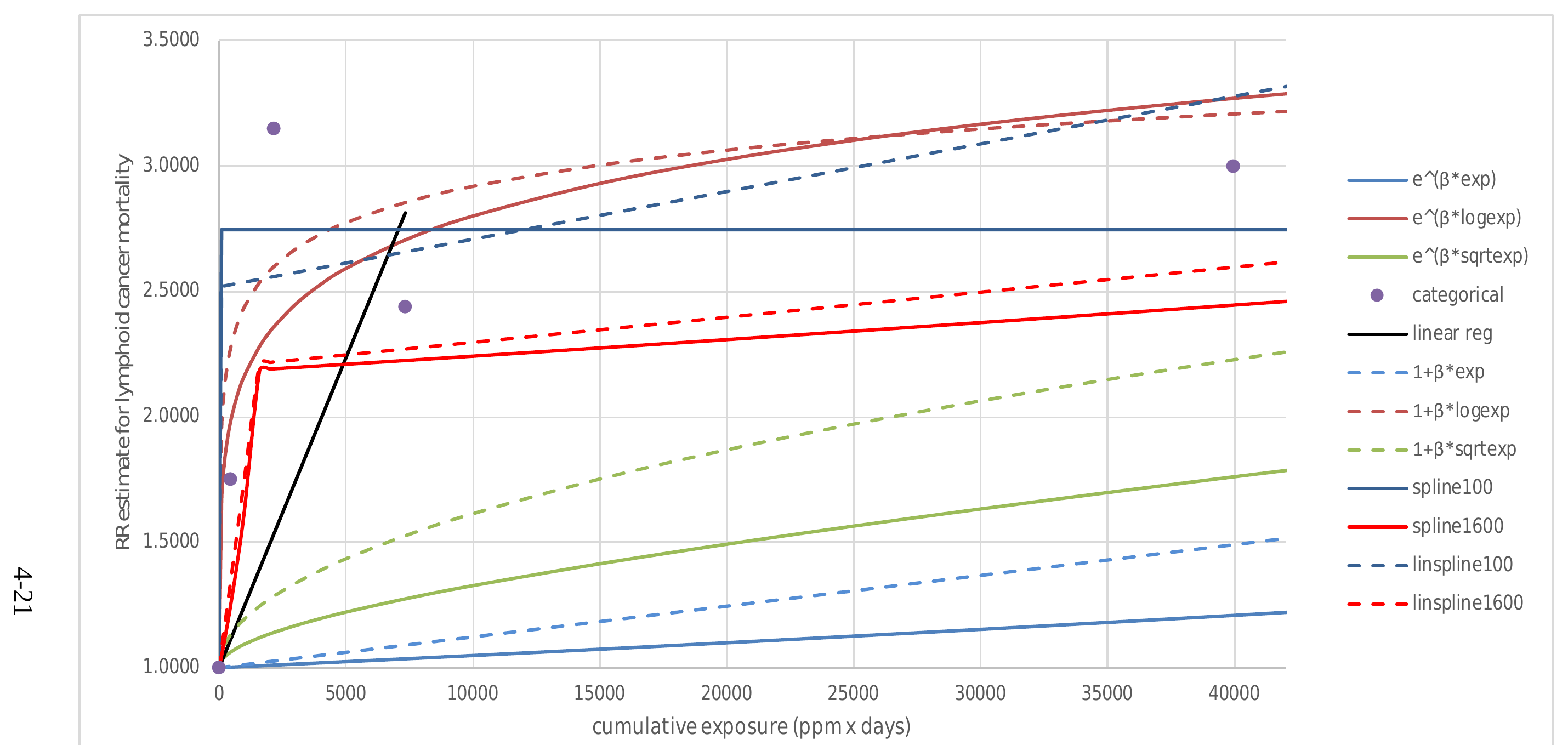
TCEQ’s Toxicology, Risk Assessment, and Research Division picked a different curve off that same chart — the one labelled e^(B*exp), which is known as Cox regression. It is the line running along the bottom, reaching about 1.2 where the measurements sit around 3.
TCEQ’s scientists reproduced the figure using the same data for its assessment.
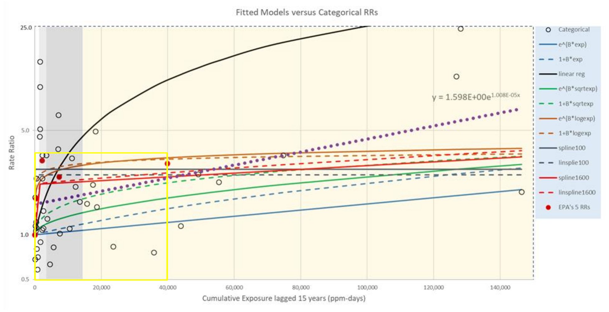
TCEQ’s figure contains the 44 cases of the four exposed groups (empty circles), and the text argues that the steep-then-flat shape is “an artifact of summarizing the RRs into quintiles.” The argument then goes that none of these curves fit the scatter well, so any of them can be chosen. In its own words:
... the linear two-piece spline model with a “knot” at 1,600 ppm-days used by USEPA (2016) does not fit the data statistically significantly better than the null model (zero slope) at the 5% significance level (i.e., the linear two-piece spline model does not explain the variability in the data statistically significantly better than the null model). Likewise, the standard Cox regression model preferred under TCEQ (2015) does not fit the data statistically significantly better than the null model. Additionally, the AIC values for the Cox and the linear spline models are similar. Thus, based on standard statistical model fit criteria (i.e., p-values and
AIC values), neither model provides a statistically superior fit to the modeled individual lymphoid cancer mortality data.
They claim that even visually the fits are about the same: “[T]hese figures show that the two models fit the individual RRs about the same,” and the model preferred by USEPA “cannot be visually judged to provide better fit than the TCEQ-preferred model.”
Notably, in this figure the vertical axis is logarithmic, which pulls the curves visually together, while the horizontal axis is left linear. The issue with that is that the most important part gets compressed into a few data points on the left.
TCEQ’s argument then goes onto other reasons for preferring one equation over another, including the number of parameters (Cox regression has only one) and other reasons outside of statistical significance.
While both curves describe (and fit) the data very poorly, the choice between them is actually very important.
The population’s exposure is far lower than these workers’. However, the general population is also far more numerous and more vulnerable. Workers are on average healthier people, which EPA recognizes itself in the appendix in this very assessment, where it notes that healthier workers stay in the workforce while sick ones leave and that this “tends to create a downward bias in exposure-response coefficients.” Therefore, even a small risk multiplied by a large and sensitive population might lead to dangerous exposure levels.
Here are the same data with both axes on a logarithmic scale, plotting the extra risk each curve predicts rather than the total risk, resulting in both fits being straight lines. Representing data in this way makes the disagreement visible. The USEPA’s and Texas’ curves differ by the factor of 270× in the leftmost part of the figure, a region that is invisible in the official figures.
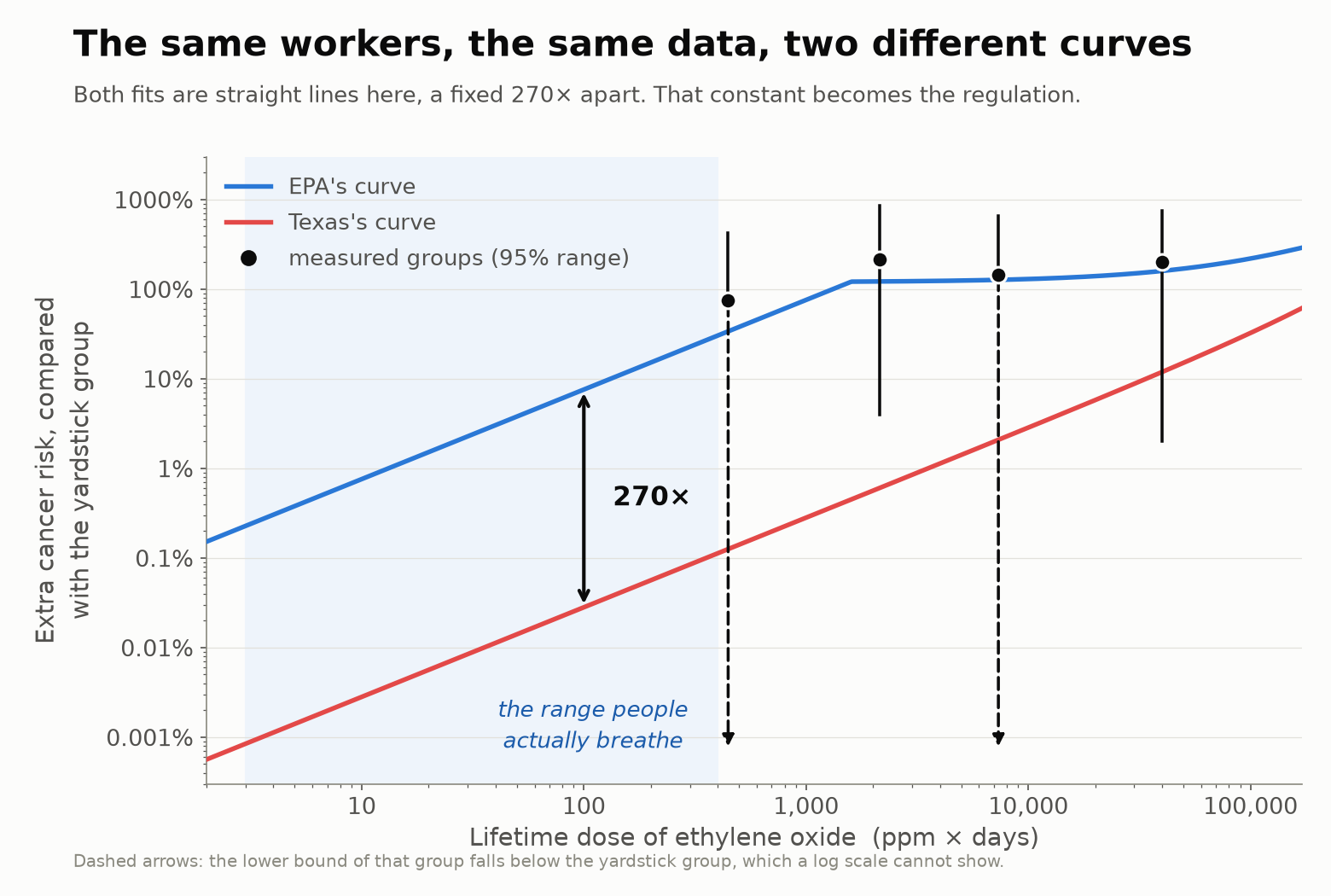
The air ethylene oxide concentration in urban areas is about 9 ppm × days (in units of these figures, see appendix below for derivation). The regulation is therefore extrapolated from 446, the average dose of the lowest measured group, down to 9 by a choice of curve. This choice gives the difference of 270 times.
I believe this fitting procedure would sadden anyone who has ever worked with data. The quality of the data itself and its statistical power is too poor to support conclusions this far-reaching. Beyond that, relying on a single study, no matter how reputable or trustworthy the authors are, also leaves no room to catch human error. And then we see that nothing in the way the fits are chosen resembles a cautionary approach.
Other types of gaps
The other reasons for what creates a gap between agencies’ limit estimates shown in Figure 1 for multiple chemicals have troublingly similar stories in other forms.
Another type of gap is safety margins, that are sometimes called uncertainty factors — the divisors that stand in for what a study cannot tell you — where Texas repeatedly turns a 10 into a 1. For instance, the acrolein document states: “A UFSub of 1 rather than 10 was applied for adjustment from sub-chronic to chronic duration,” resulting in a limit that is 138 times weaker than USEPA’s. We have written about where some of those round numbers come from and why they are conventions rather than measurements: Of Mice and Men and Round Numbers.
Also, underneath every limit for a carcinogenic chemical sits one more choice. The safety threshold in Texas effectively accepts one extra cancer per 100,000 individuals (per chemical) rather than one per million. Its own guidance said for nearly eighteen years that this 1-in-100,000 goal had been “approved by the Commissioners and Executive Director of the TCEQ,” until the agency conceded in 2024 that “the target risk level was not officially approved and voted on by the Commissioners.” We have written previously why some agencies adopt the number one in 100,000, while others use one in a million.
Why this matters
This huge gap in the Ethylene oxide regulatory limits did not go unnoticed. ProPublica and the Texas Tribune reported about the potential risks from a Laredo sterilization facility built next to an elementary school that emitted far more ethylene oxide than any other sterilizer plant in the country. The public pushed back, and in January 2022 USEPA proposed to reject the Texas’ lenient limits for ethylene oxide, stating that Texas' "risk model [...] resulted from a flawed analytical approach". USEPA, however, has no power to overturn a screening level that Texas applies internally. What it can do is refuse to use the Texas number in federal decisions, which is what happened: in the December 2022 reconsideration of the Miscellaneous Organic Chemical Manufacturing rule, USEPA determined that TCEQ's value "is unsuitable for use as an alternative to the 2016 IRIS [EPA’s Integrated Risk Information System] value."
That was only one chemical, and it took years for a change. The first figure shows similar machinery running through a whole library of chemicals — and almost none of the rest have received a similar amount of attention and scrutiny. With AI it is now possible to scale up such investigations.
Every gap in that first figure comes apart into the same short list of choices: which study you use, which model is chosen to fit the data, how much margin you keep for what you don’t know, and how much risk you call acceptable.
The transparency AI can provide is that now each choice in an assessment can be pulled out, named, and verified.
Another interesting pressure might now be applied to regulatory agencies. Workload and busyness have always been both a real constraint and an excuse not to reply to requests. If AI gets implemented by the regulators, answering any question becomes trivial. A regulator would have no excuse not to allow an investigative journalist or a non-profit to interrogate a departure from federal guidance.
That is the kind of reckoning AI may bring to regulatory agencies. The pessimistic scenario, of course, is that this exposure will incentivize polluters to lobby politicians who favor hiding data from AI, or even prohibiting data collection altogether.
Appendix: How workers' exposure is compared with public's exposure
The figure’s x-axis is cumulative occupational dose in ppm × days, because that is the unit the worker study is in. Texas gives the conversion in a footnote to Table 39 of its assessment:
Equivalent Occupational Exposure 70 years (ppm-days) = EC (ppm) × (365/240 days) × (20/10 m³) × (365.25 days/year) × (70 years − lag in years)
Three adjustments are built into this equation: workers are exposed about 240 days a year rather than 365; they breathe roughly 10 m³ during a working shift against 20 m³ over a full day; and the dose accumulates across a 70-year lifetime minus the 15-year exposure lag. With that lag, the multiplier is:
(365/240) × (20/10) × 365.25 × (70 − 15) = 61,103
Monitored urban background of 0.1–0.2 ppb converts to 6–12 ppm-days, against a lowest measured group of 446.